
Industry
Consumer Technology
My Role
UX Researcher & Designer
Timeline
Oct - Dec 2024 | 7.5 weeks
Reimagining the MacBook Pro Touch Bar to Make It More Intuitive and Useful

The Challenge: Innovation That Didn’t Work for Users
When Apple Inc. introduced the MacBook Pro Touch Bar, it was positioned as the future of laptop interaction—a dynamic replacement for traditional function keys.
But in practice, many users found it frustrating rather than helpful. Instead of simplifying workflows, it introduced friction:
Low visibility: Users didn’t know what features existed
Unclear interactions: Icons were confusing or unfamiliar
Limited control: Customization was difficult
Frequent errors: Accidental taps disrupted tasks
At its core, the Touch Bar wasn’t aligning with how people naturally work.
How might we make the Touch Bar more visible, intuitive, and customizable so it enhances—not hinders—user workflows?

What We Learned from Users
To understand real-world usage, we conducted a survey with 11 MacBook Pro users.
Key Insights:
Average usability rating: 2.5 / 5
27% rarely or never used the Touch Bar
Many preferred keyboard shortcuts for speed and reliability
Users were frustrated by disappearing controls and a lack of tactile feedback
The Touch Bar wasn’t failing because of its technology—it failed because it didn’t match user habits or expectations.

Where the Experience Breaks Down
Using heuristic evaluation, we identified consistent usability issues:
Lack of clear feedback after actions
No easy way to undo mistakes
High chance of accidental taps
Icons required guessing instead of recognition
Customization was limited and hard to access
Heuristic | Severity Rating | Finding | Recommendation |
|---|---|---|---|
Visibility of System Status | Minor (2) | Users lack awareness of certain Touch Bar features, causing confusion during complex actions. | Integrate visual cues or brief notifications (e.g., animations) to indicate status and functionality during use. |
Match Between the System and the Real World | Moderate (3) | Some icons (e.g., highlighting, mission control) are not intuitive, leading to misunderstandings. | Standardize iconography for universal recognition or add tooltips to clarify functions when hovered/tapped. |
User Control and Freedom | Minor (2) | The dynamic nature of the Touch Bar can cause unintended actions without easy undo options. | Add an undo option or confirmation prompt for actions initiated via the Touch Bar to enhance control. |
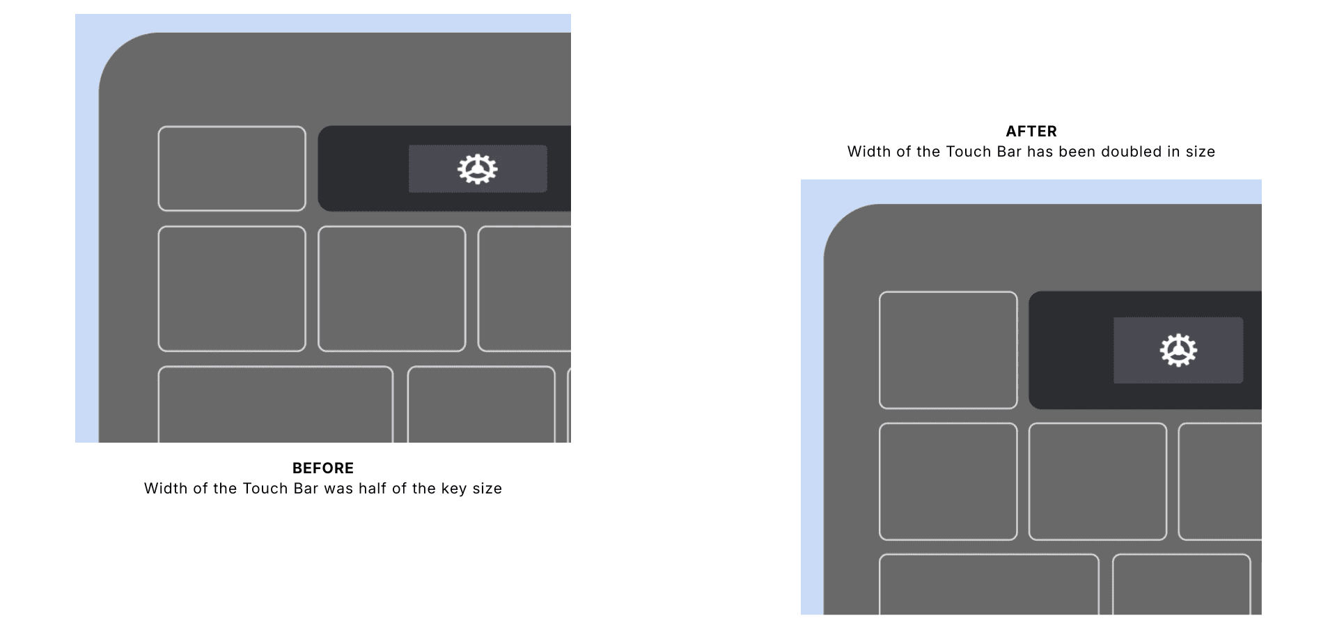
Error Prevention | High (4) | Small, closely spaced buttons increase accidental touches due to sensitive controls. | Redesign the layout with more spacing and add tactile feedback (e.g., haptic response) to prevent accidental actions. |
Flexibility and Efficiency of Use | Moderate (3) | Limited customization and narrow width restrict user efficiency and workflow adaptation. | Allow icon rearrangement and customization; consider Touch Bar relocation to enhance efficiency. |
Help and Documentation | Minor (2) | Lack of contextual help or tutorials causes uncertainty about available features. | Include a built-in help feature or quick reference guide accessible directly from the Touch Bar. |
The experience relied too much on recall and precision, instead of clarity and control.
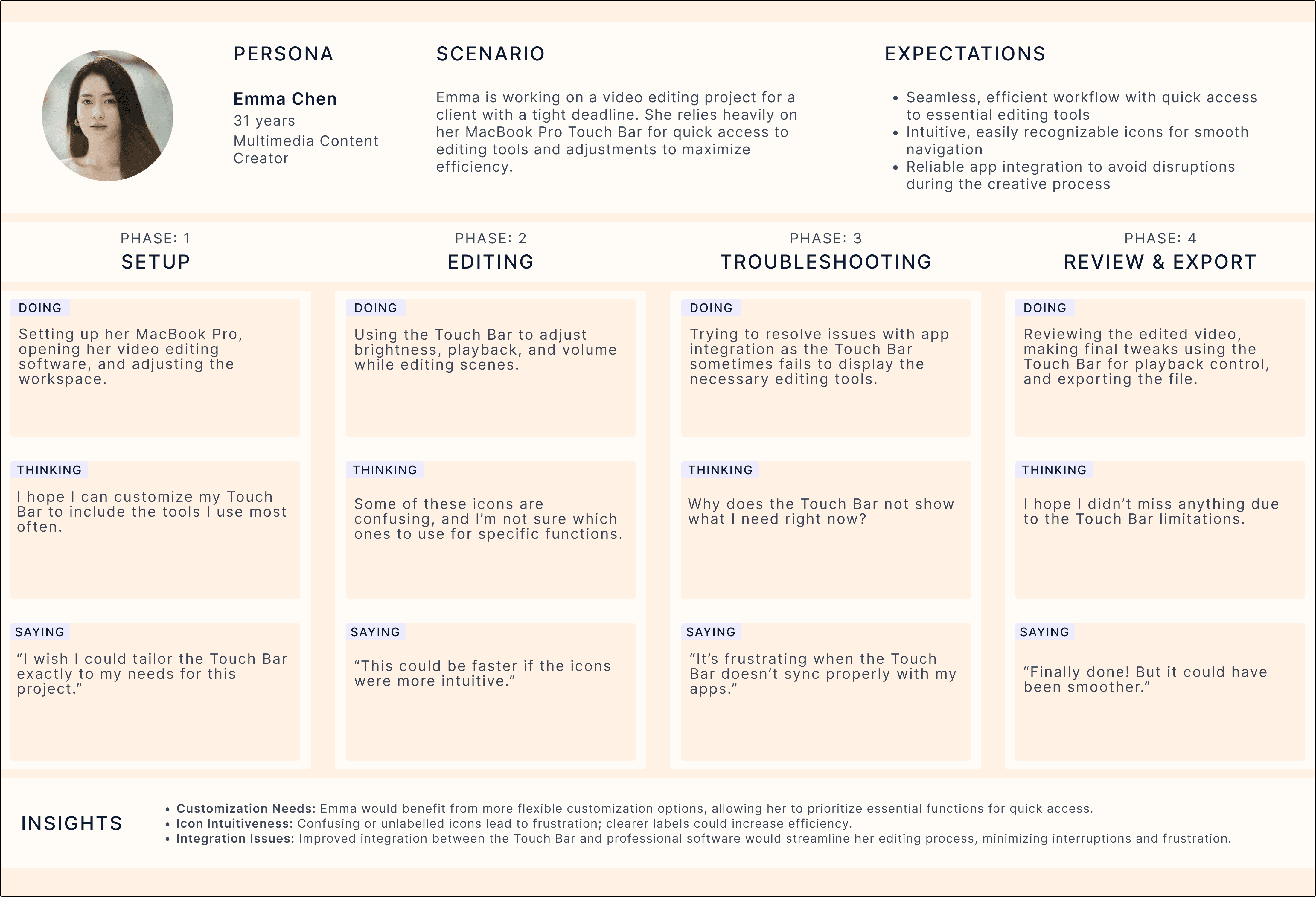
Observing Real Behavior
Through task analysis and usability testing (10 participants), I observed how people interacted with the Touch Bar in everyday scenarios.
Task Type | Example Task | Observation Summary |
|---|---|---|
Frequent Function | Adjust screen brightness | Users immediately recognized the sun icon; completion was fast and confident (3–4 seconds). |
Less Frequent Function | Access Mission Control | Participants hesitated, pressed wrong buttons, or defaulted to trackpad gestures; average time 17–24 seconds. |
Web Navigation | Open a new browser tab | Most relied on the trackpad due to habit; scanning the Touch Bar took longer (6–12 seconds). |
Highlight Interaction | Highlight a sentence in Preview | The icon was unclear; users described it as “a random symbol” and preferred traditional methods. |
Media Controls | Play, pause, skip, adjust volume | Universally successful - icons were recognized and actions confirmed via visual feedback. |
What Worked Well
Simple, familiar actions (like brightness and volume) were fast and intuitive
Recognizable icons led to confident interactions
Where Users Struggled
Tasks like Mission Control or highlighting text caused hesitation
Users often defaulted to keyboard shortcuts or trackpad gestures
The dynamic layout disrupted muscle memory and flow
When interactions required thinking, users avoided the Touch Bar entirely.
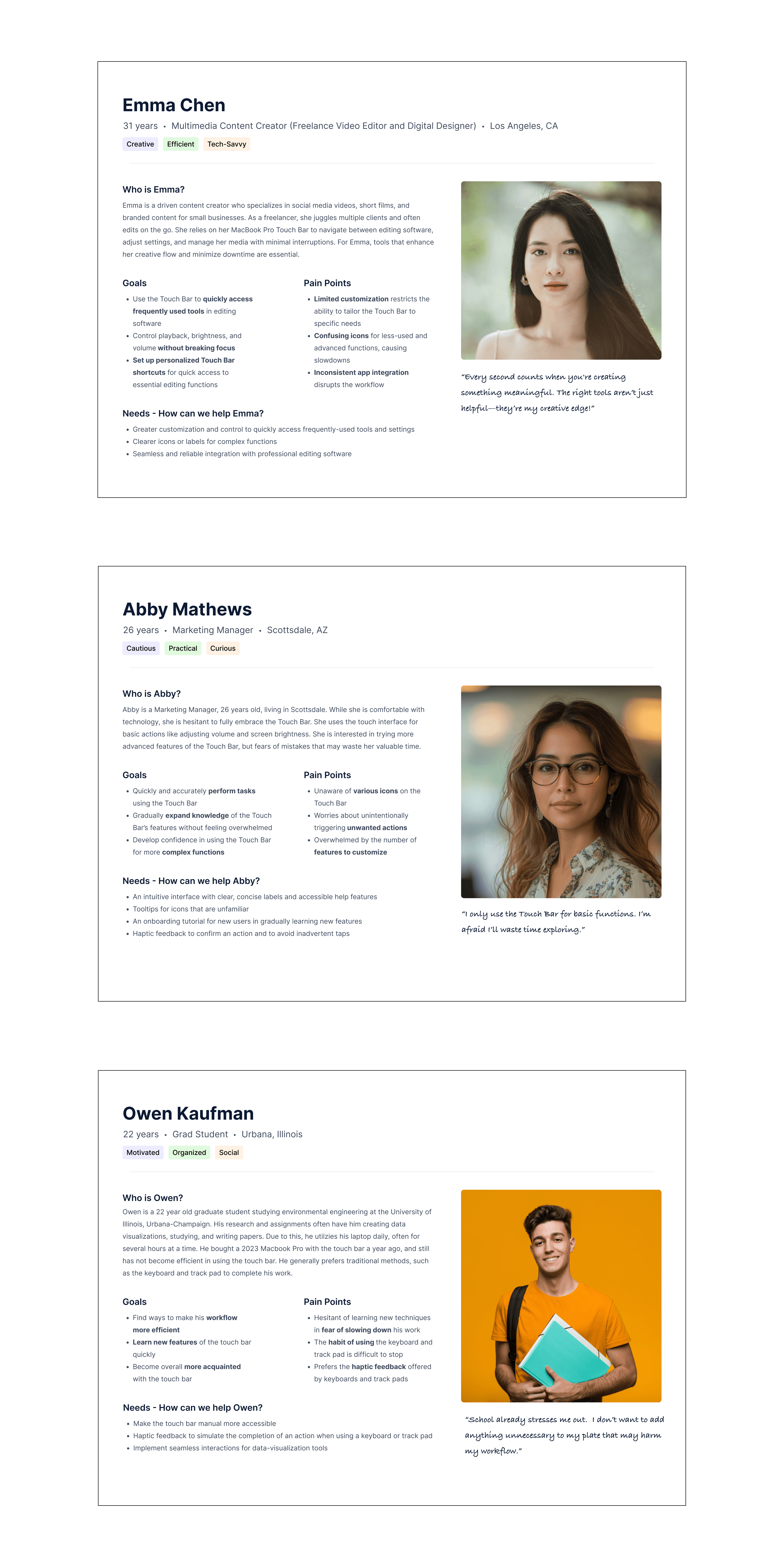
Understanding Different Users
We identified three behavior patterns:
The Traditionalist — sticks to keyboard shortcuts
The Curious Learner — tries the Touch Bar but doesn’t stick with it
The Pro User — wants efficiency but feels limited
Design Direction: Make It Clear, Personal, and Forgiving
From the research, three principles guided the redesign:
Make it clear → Improve visibility and feedback
Make it personal → Allow customization and control
Make it forgiving → Reduce errors and support recovery
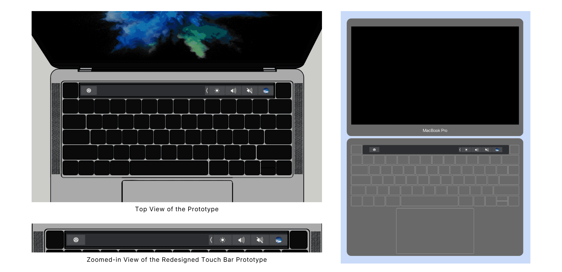
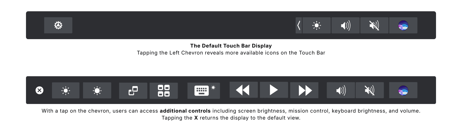
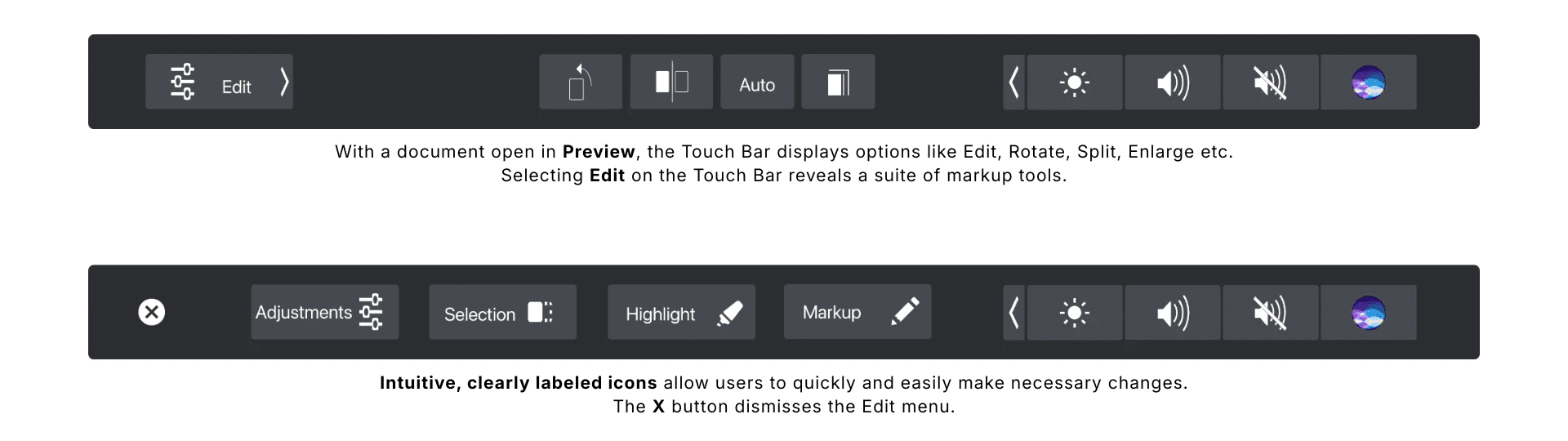
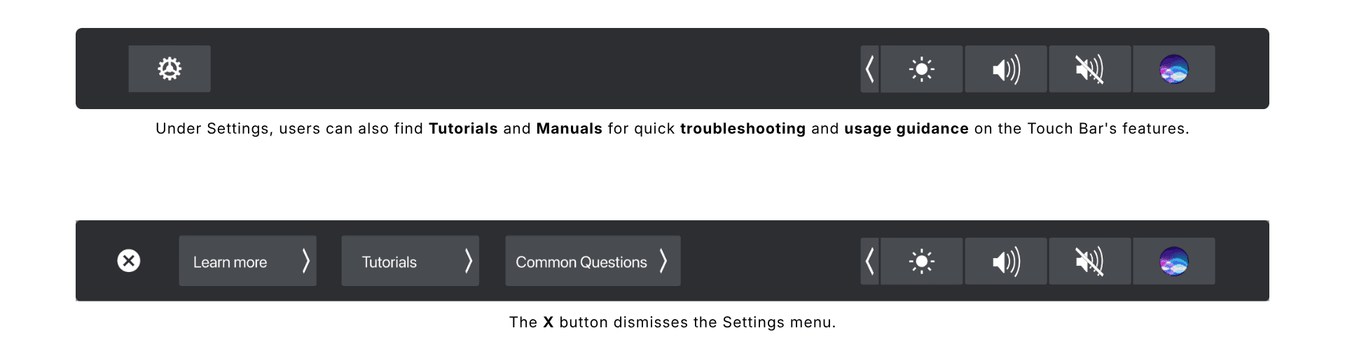
The Solution: Touch Bar 2.0
We redesigned the Touch Bar to better support real workflows:
KEY IMPROVEMENTS
Persistent Controls
Always-visible access to essential actions like brightness and volumeWider, Spaced Layout
Reduced accidental taps and improved accuracyUndo / Reset Option
Quick recovery from unintended actionsDual Modes
Minimal View for focus
Expanded View for advanced tasks
Improved Feedback
Subtle animations confirm actions in real time
The redesign made the Touch Bar feel predictable, usable, and worth engaging with.

Impact & Reflection
Reduced user frustration and accidental interactions
Improved confidence in using the Touch Bar
Encouraged adoption among both new and experienced users
What I Learned
Even innovative interfaces fail if they ignore mental models
Visibility, feedback, and control are essential in any interaction
Combining research methods leads to stronger, more actionable insights
Next Steps
If I were to take this project further, I would:
Explore adaptive customization based on user behavior
Test the redesign over time to evaluate long-term adoption