
Industry
Nonprofit / Community Service
My Role
UX Researcher & Designer
Timeline
Sept - Nov 2023 | 14 weeks
Redesigning the Everett Animal Shelter Website to Make Adoption, Volunteering, and Support Easier and More Intuitive

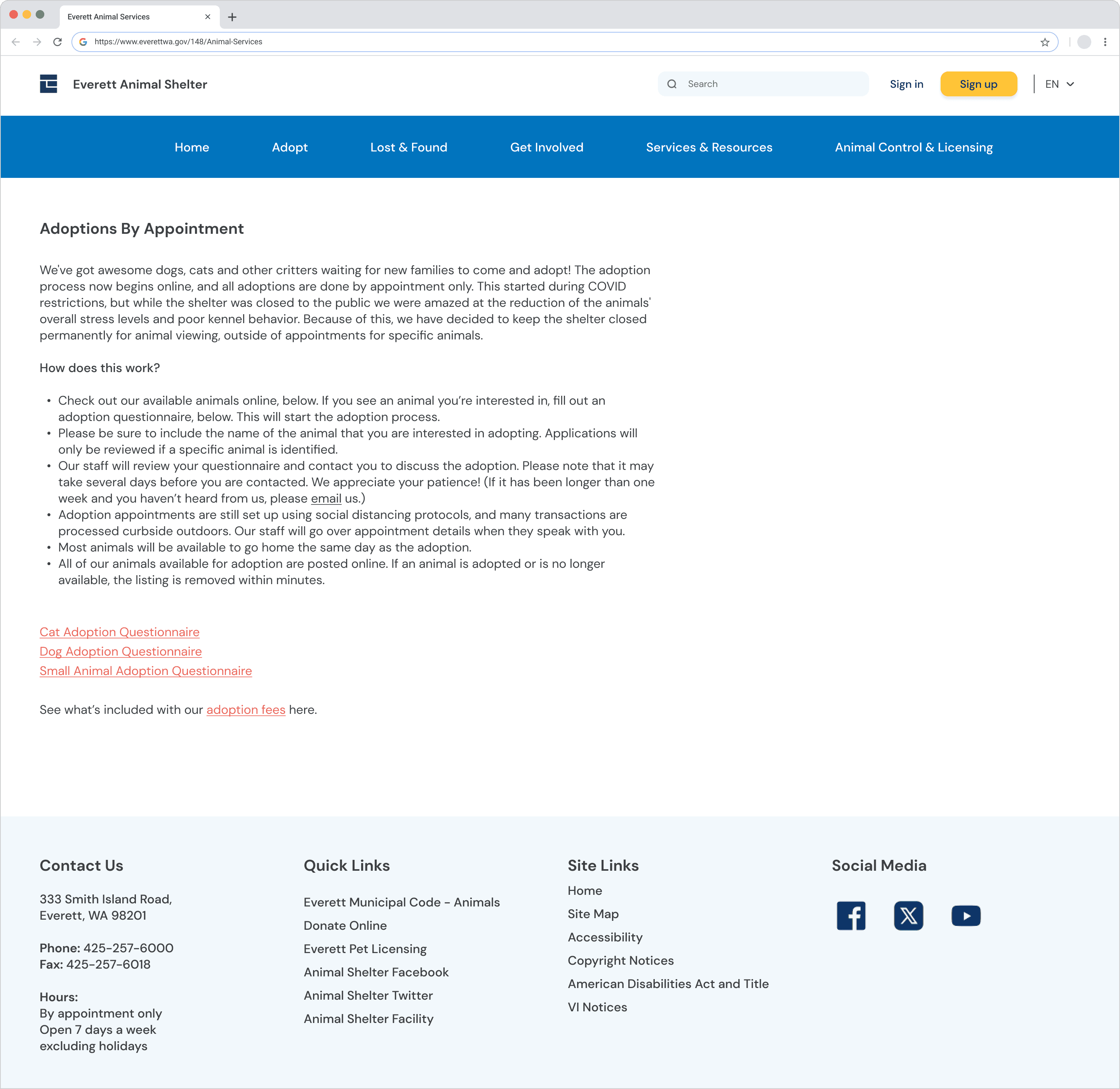
The Challenge: A Caring Mission Lost in Clutter
The Everett Animal Shelter website plays a critical role in connecting animals with adopters, volunteers, and foster caregivers in the community. But despite its meaningful mission, the experience often made simple tasks feel difficult.
Users struggled with:
Cluttered layouts that buried key information
Inconsistent navigation that caused backtracking
Limited filtering when browsing adoptable pets
The result wasn’t just inconvenience; it created friction in moments where users were already emotionally invested.
How might we help visitors find what they need easily while creating a warm, trustworthy experience that reflects the shelter’s mission?


Research & Methodology
To understand where users were getting stuck, I used a multi-method research approach in which each step informed the next.
HEURISTIC EVALUATION
Using Nielsen’s 10 Usability Heuristics, I identified immediate usability issues:
Inconsistent navigation
Weak feedback loops
Poor visual hierarchy
USER SURVEYS [6 participants]
I gathered behavioral insights on how people interact with animal shelter websites.
Key takeaway:
Users felt unsure about the adoption process and struggled to locate important pages.
USABILITY TESTING [5 participants]
I conducted think-aloud sessions using real-world scenarios like adopting, volunteering, and fostering.
Observed challenges:
Cluttered pages made scanning difficult
Contact information was hard to find
Searching for pets felt tedious and limiting
Users were highly motivated and patient but the interface worked against their intentions, making simple actions feel unnecessarily complex.
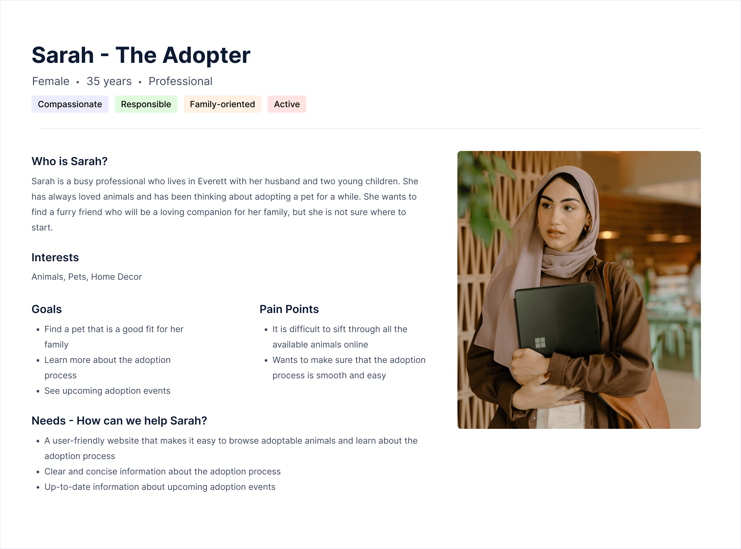
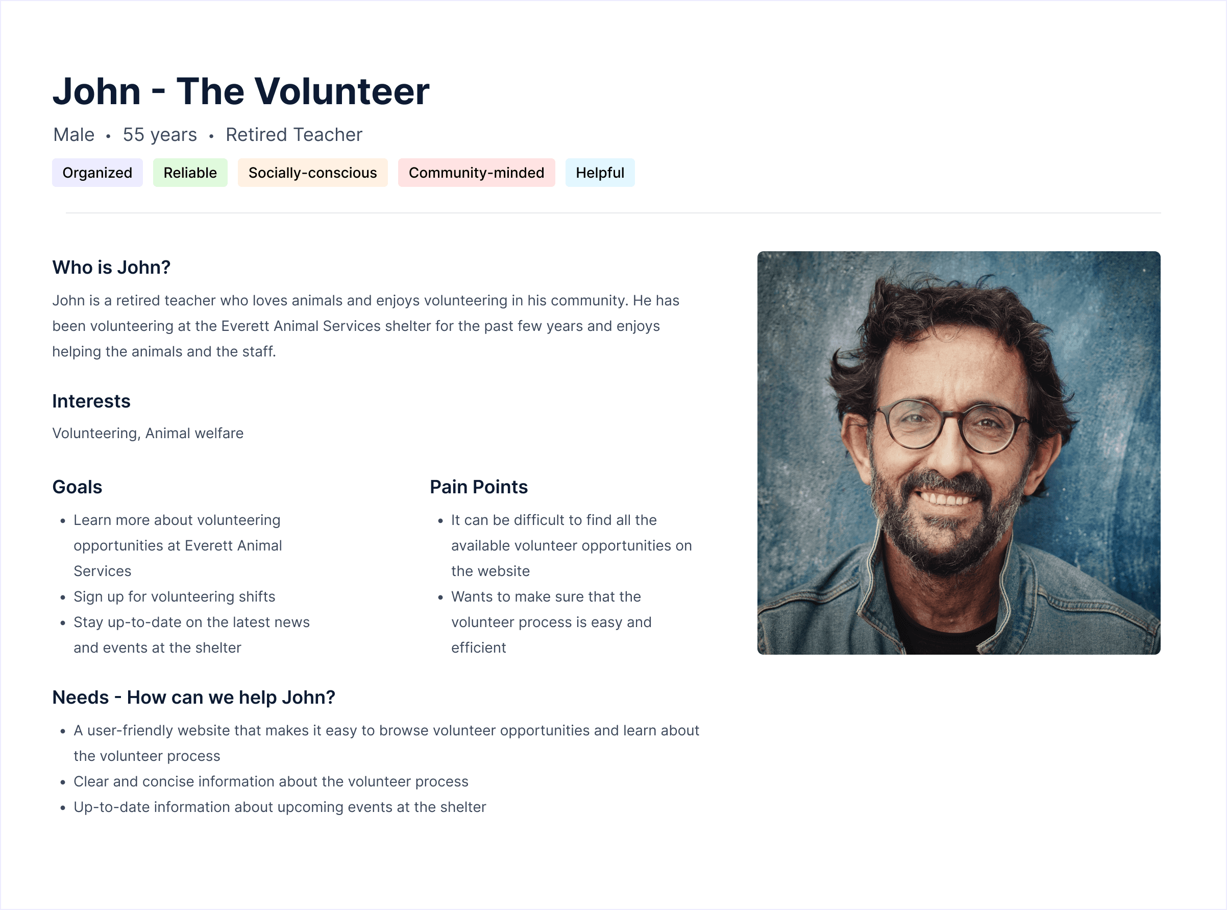
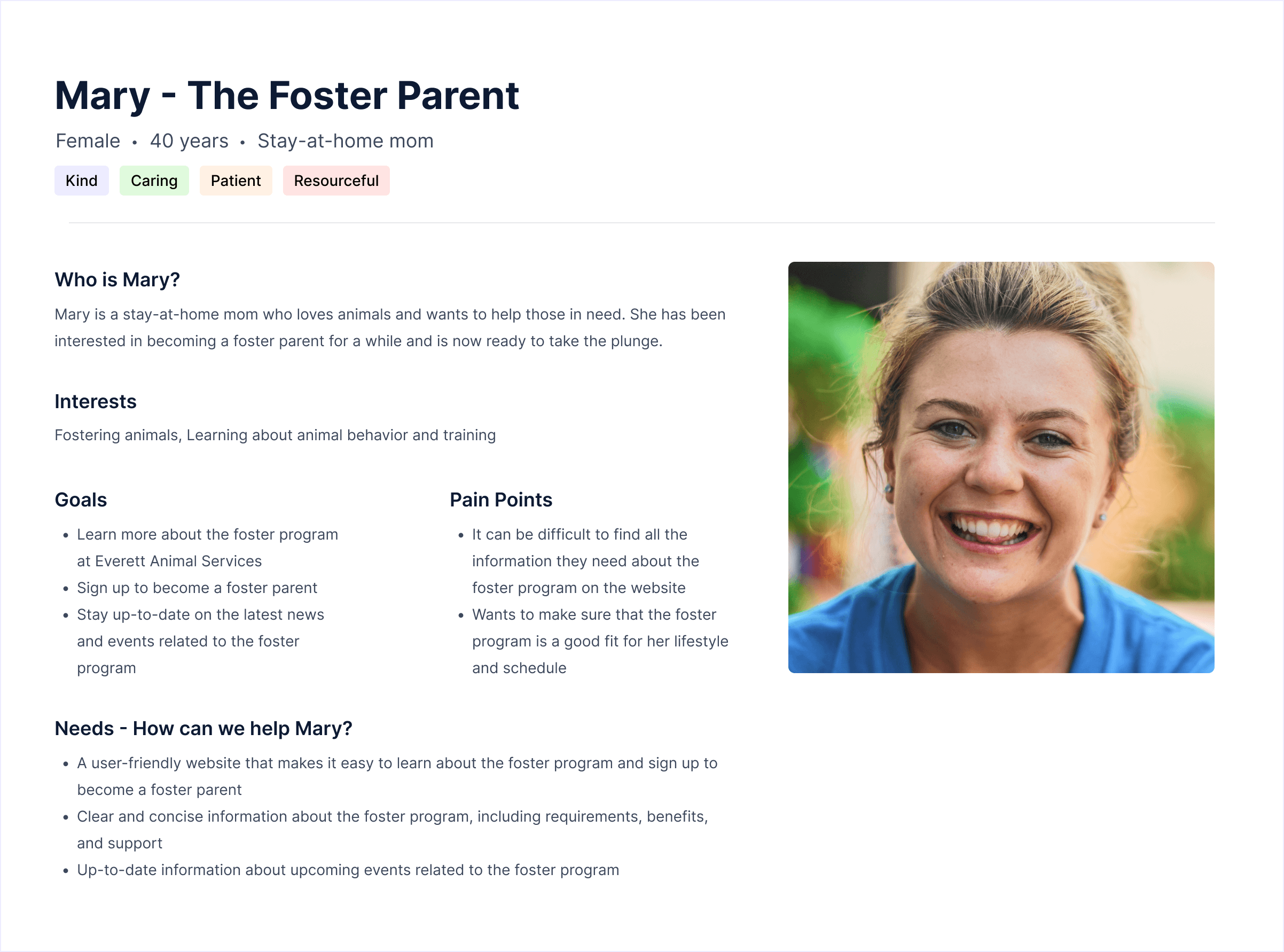
Users & Scenarios
Participants reflected the shelter’s core audience:
Busy professionals, families, retirees, and animal lovers
Ages 28–57 with varying levels of tech comfort
What connected them all was simple: A genuine desire to help animals.
Core Scenarios Tested
Participants completed key journeys to uncover friction:
Adopt a Pet: Browse, filter by type, and contact the shelter.
Learn the Adoption Process: Understand adoption steps, fees, and timelines.
Volunteer: Find and apply for volunteer roles.
Foster: Locate and submit a foster application.
Even with strong intent, users had to work harder than expected to complete these tasks.
What I Observed and Heard
Most users eventually completed tasks, but not without friction.
Top Pain Points:
Cluttered interface
“There’s so much text—it’s hard to know what matters.”Unclear hierarchy
Users couldn’t distinguish between sections easilyHidden contact information
Often only found in the footerWeak search and no filters
Browsing for pets felt slow and frustratingOutdated visuals
The experience didn’t reflect the warmth of the mission
Performance Metrics:
User Story | Goal | Success Rate | Avg. Completion Time | Key Pain Point |
|---|---|---|---|---|
#1 Browse Adoptable Pets | Find a family-friendly dog | 60% | 25.6 sec | No filters, cluttered layout |
#2 Learn About Adoption | Understand process & fees | 100% | 25.4 sec | Hidden contact form |
#3 Explore Volunteering | Find a role and apply | 100% | 13.2 sec | Minor scanning issues |
#4 Become a Foster | Apply to foster animals | 100% | 12.2 sec | Application buried in text |
Cross-task | Find contact info | 60% | 45.4 sec | Inconsistent visibility |
The issue wasn’t missing content—it was findability and clarity.
Users needed simplicity, structure, and emotional connection.
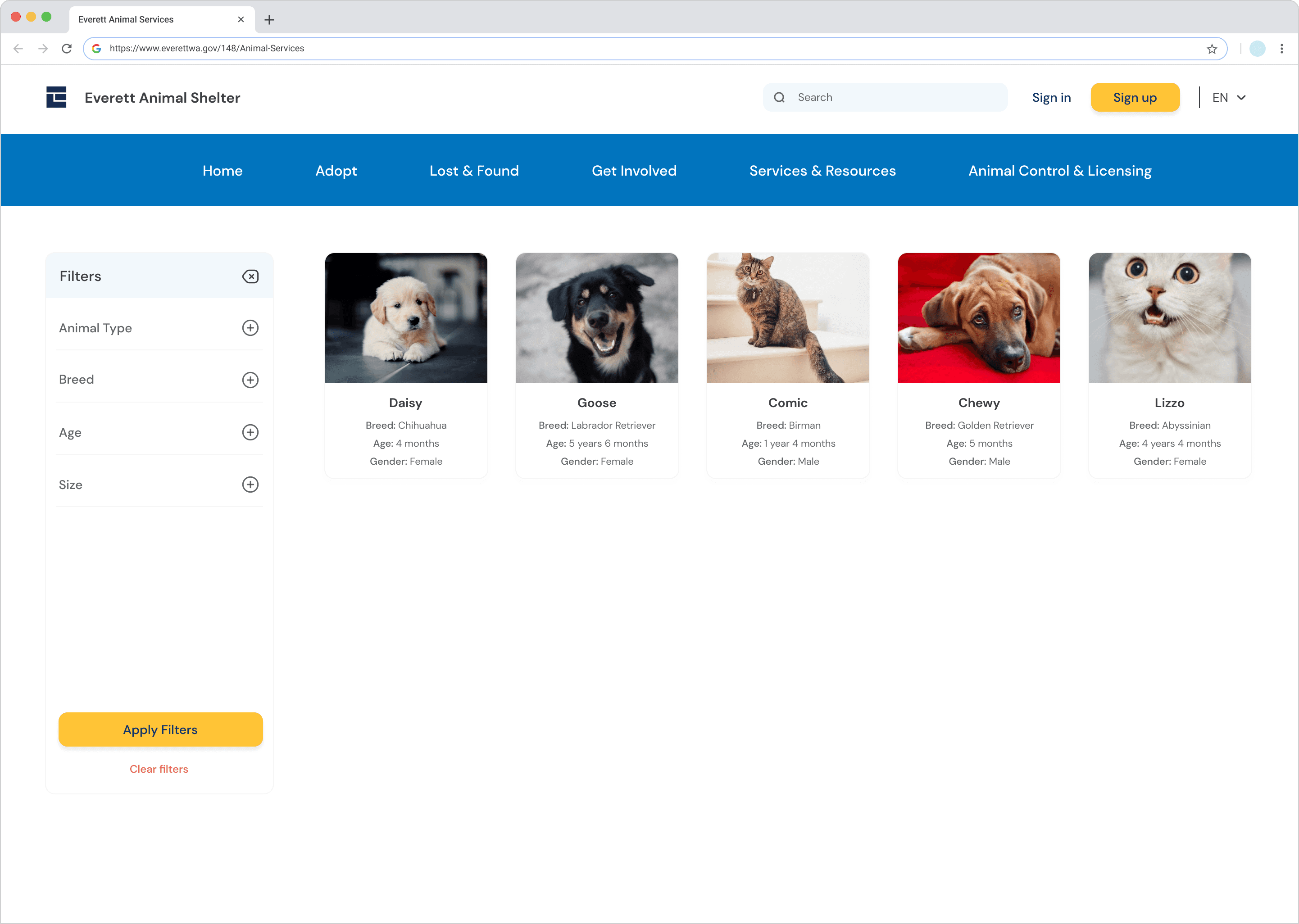
From Research to Design: Turning Insights into Action
I translated each insight into a focused design decision:
Finding | Design Response |
|---|---|
Users couldn’t filter or sort adoptable pets | Added intuitive filters |
The homepage felt overwhelming | Simplified layout with clear, scannable sections |
Contact info was buried | Added a persistent contact bar across pages |
Users couldn’t tell what was clickable | Introduced consistent visual hierarchy for buttons and links |
Pages felt outdated and cold | Adopted colors, white space, and real pet imagery |
Design Principle: Create an experience that feels clear, kind, and emotionally connected.
Hi-Fidelity Prototype
The final prototype brought these improvements together into a cohesive experience:
Simplified and consistent top navigation
Redesigned Adoptable Pets page with filters and a clean grid layout
Persistent contact panel across pages
Updated tone and visuals to feel more welcoming and human
Outcome:
The redesigned experience reduced friction and made key actions feel faster, clearer, and more rewarding.


Impact & Reflection
The redesign led to meaningful improvements:
Increased clarity and discoverability of key actions
Reduced effort when browsing adoptable pets
Strengthened trust and emotional connection with the shelter
What I Learned
Combining multiple research methods reveals deeper insights
Emotional design is essential in community-driven experiences
Small usability improvements can significantly reduce effort
Next Steps
If I were to take this project further, I would:
Conduct another round of usability testing on the hi-fi prototype
Partner with the Everett Animal Shelter to measure real-world outcomes like adoption and volunteer conversion